with Irma Boom Office + Rijksmuseum, Amsterdam—The Netherlands, 2013
260 pages — 20x25 cm


Irma Boom Office is responsible for the making of the visual identity for the newly restored Rijksmuseum and the design of all publications.
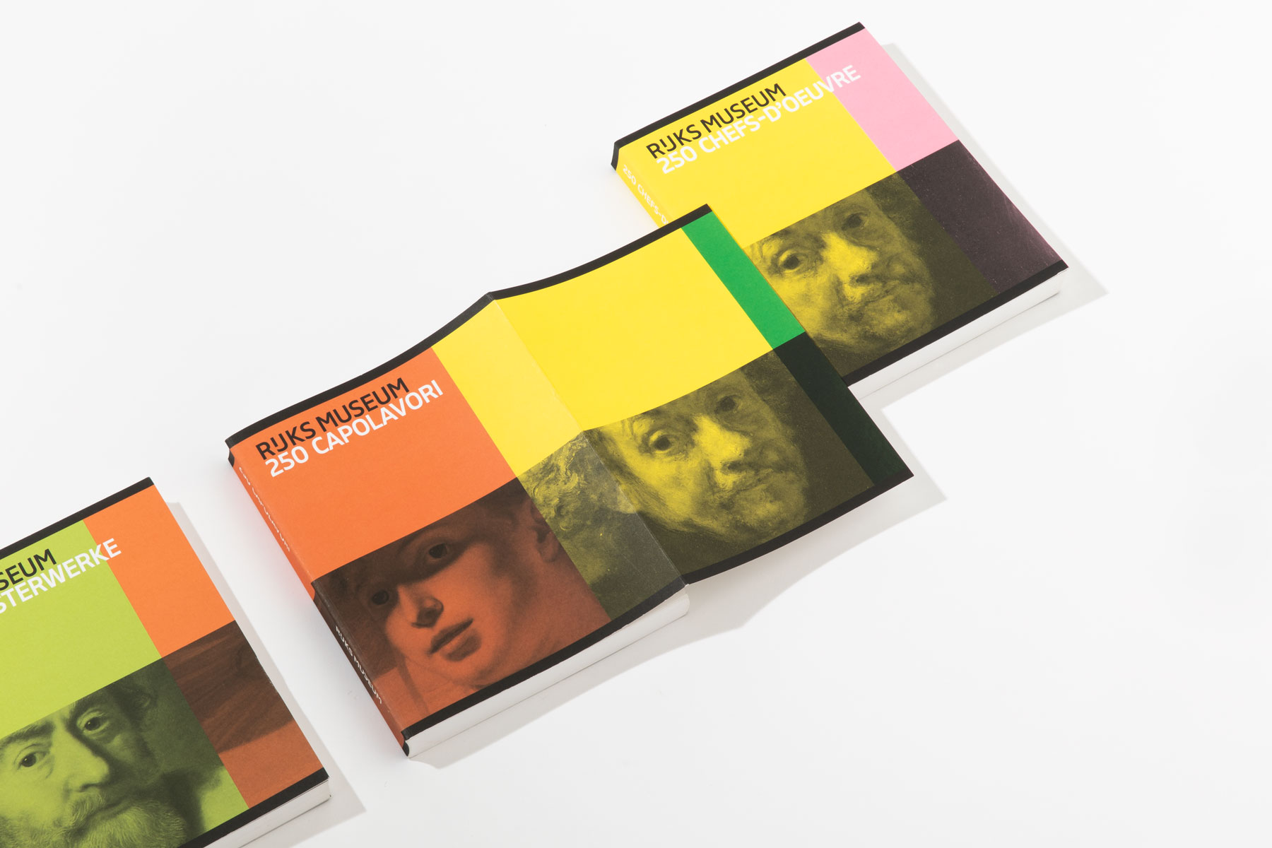
During my time at the office, I personally worked on 250 Highlights, a photographic book featuring the highlights of the collection. It is available in ten languages; each language features a different cover, connected by the colours that overflow from one cover to the other.
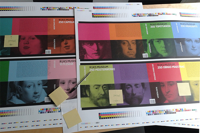
The Rijksmuseum house style incorporates an original typeface – designed by Irma Boom and developed by Paul van der Laan of Bold Monday font foundry – and a notable colour palette. Based on highlights of the museum’s collection and used in a variety of visual manifestations, this colour scheme is the ‘DNA’ of the Rijksmuseum.